Invasive Map
Overview
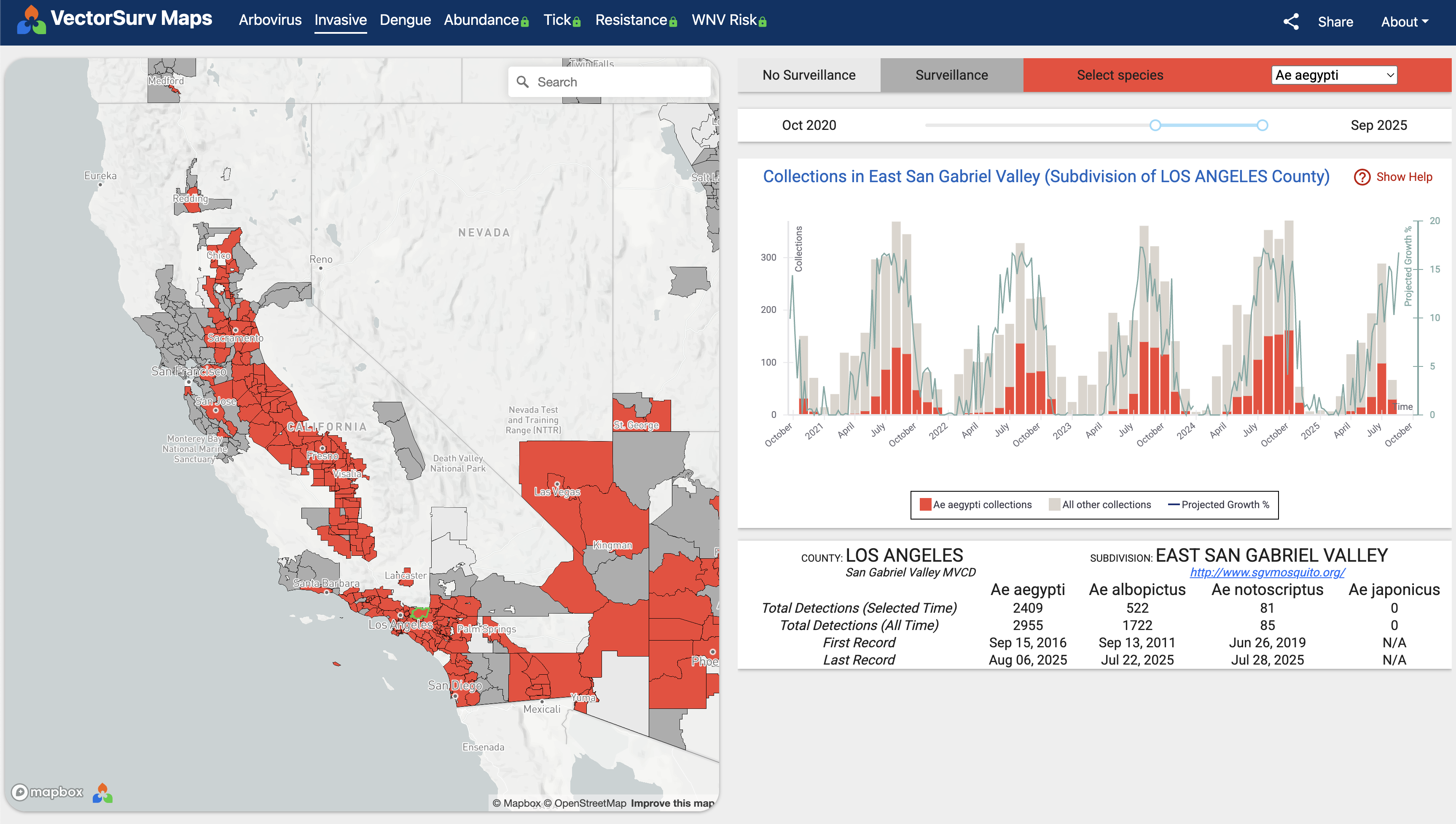
The VectorSurv invasive map shows the spread of invasive mosquito species over time, based on collection data submitted to VectorSurv. The map is refreshed once daily at midnight Pacific Time and may not display real-time data.
Map
Collection events are aggregated spatially into regions on the map, each of which represents the intersection of a census county subdivision and the boundary VectorSurv has on record for the member agency covering that area. The color in each region corresponds to the known presence or absence of the species:
Red indicates that the selected species was detected within the selected timeframe. 
Gray indicates that at least one collection occurred within the selected timeframe, but no mosquitoes of the selected species were found. 
Light gray indicates that no collections occurred within the selected timeframe. 
Chart
Clicking any region replaces the tutorial card with a chart. Chart items can be shown or hidden by clicking the legend below the chart.
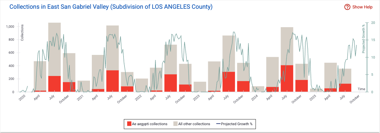
Bar Chart
The chart uses a stacked bar format to show collection events over time, with time on the horizontal axis and the number of collection events on the vertical axis.
Each bar comprises up to two colored segments:
- Red — collections containing the selected species
- Gray — collections not containing the selected species
Mousing over any bar brings up a tooltip with detailed counts.
Based on the selected timeframe, charted collection events are aggregated:
- By week when the selected timeframe is 2 years or less
- By month when the timeframe is between 2 and 5 years
- By quarter when the timeframe exceeds 5 years
Projected Growth Line
The overlaid projected growth line, which is available only for certain species, is a function of temperature. VectorSurv uses NLDAS temperature data.
Summary Table
Clicking any region displays a summary table section below the chart.
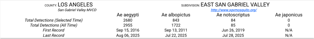
The summary includes:
Regional Information
- County
- County subdivision
- Member agency covering the area
- Member agency website
Species Information
- Total detections in the selected timeframe
- Total detections all time
- Date first found
- Date last found
Species shown include:
- Aedes aegypti
- Aedes albopictus
- Aedes notoscriptus
- The species currently selected
The first three species are always included. They are considered the invasive species of greatest concern across the United States due to their status as Dengue/Chikungunya/Zika virus vectors.